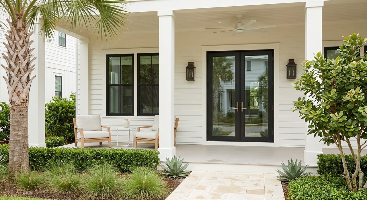
If you have ever looked at a WaterColor home and thought, this just feels different, you are noticing a design language that is carefully shaped from the ground up. In WaterColor, the charm is not accidental, and the details are not random. When you understand what defines these homes, you can better evaluate a property, market one effectively, or simply appreciate why the community has such a distinct identity. Let’s dive in.
What Makes WaterColor Design Stand Out
WaterColor is a 499-acre master-planned community in Walton County along Scenic Highway 30A, established in 1999. Its setting between the Gulf of Mexico, Western Lake, and a longleaf pine forest plays a major role in how homes are designed and how the neighborhood feels from street to street.
Just as important, WaterColor’s appearance is guided by an active system of design standards, color palettes, plant palettes, and amendments. That means the community’s visual appeal is managed with intention, helping homes feel connected to one another while still allowing for individual character.
A Coastal Vernacular Foundation
The design philosophy in WaterColor draws from American Coastal and Florida vernacular traditions. In practice, that means buildings are meant to feel elegantly scaled and proportioned, with simple forms that fit naturally into the landscape.
Rather than relying on heavy ornament, the overall look leans toward restraint. The goal is for each home to feel expressive but still harmonious with neighboring houses and the broader streetscape.
Porches Lead the Architecture
One of the clearest design markers in WaterColor is the front porch. In fact, porches are not just a stylistic choice here. The guidelines require a full-façade first-floor porch on all houses, and corner lots also need a side-street porch.
This requirement does more than shape curb appeal. It helps homes engage with the street, supports the walkable feel of the community, and creates that relaxed beach-house character many buyers associate with WaterColor.
Why Porches Matter So Much
A full-width porch changes how a home sits on its lot and how it is experienced from outside. It softens the transition between private living space and the street, while also adding depth, shade, and visual rhythm to the front elevation.
In listing photography, these porches often become a defining feature because they instantly communicate the indoor-outdoor lifestyle that buyers expect along 30A. They are functional, architectural, and central to the identity of the home.
Simple Forms Create Lasting Appeal
WaterColor homes are known for simple, straightforward volumes. The guidelines describe one- or two-story forms with clean massing rather than overly complex silhouettes.
That simplicity gives the homes a timeless quality. Instead of chasing trends, the architecture relies on proportion, roofline, and materials to create interest.
Signature Exterior Features
Several exterior details show up again and again in WaterColor homes:
- Simple wood columns
- Wood siding
- Vertically proportioned windows and doors
- Metal roofs
- Deep roof overhangs
- Exposed rafter tails
Taken together, these features create a look that feels both relaxed and refined. You get the comfort of a classic beach house, but with a disciplined architectural structure behind it.
Windows and Doors Stay Restrained
Another detail that defines WaterColor homes is what the design guidelines do not encourage. You will not typically see heavy ornament or fussy trim dominating the façade.
Instead, windows are required to have vertical proportions and minimal ornamentation. Doors are generally wood or aluminum clad with clear glazing or flat panels and a true-divided-light appearance, while painted operable shutters are encouraged.
The Effect of Vertical Openings
Vertical windows and doors help reinforce the elegant proportions that the guidelines call for. They also contribute to the airy feeling people often notice in WaterColor homes.
That open, breezy impression is tied to the documented standards for porch depth, vertical openings, and generous proportions. Even when homes vary in style, these repeated cues help them feel unmistakably part of WaterColor.
Color Palettes Keep the Streetscape Cohesive
Color is another major part of WaterColor’s design DNA. Each address follows a specific color approach tied to the structure and its landscape context, which helps the neighborhood avoid a mismatched or overly repetitive look.
The palette rules are specific. Trim cannot be stark white, body colors cannot repeat on adjacent lots, and trim and shutter colors are expected to stay within the community’s intended range.
Why the Colors Feel So Calm
Muted, coordinated colors help the architecture sit comfortably within the coastal setting. Instead of high-contrast combinations, the streetscape tends to read as layered and low contrast.
This is one reason WaterColor homes often photograph so well. Porch-forward massing, controlled palettes, and native greenery work together to create soft visual depth rather than sharp visual competition.
Landscaping Is Part of the Architecture
In WaterColor, the landscape is not treated as a separate afterthought. It is a core part of the design experience, and the plant palette is carefully managed to support the surrounding coastal dune scrub ecosystem.
Future landscape installations visible from the road are required to use strictly native or indigenous plants unless a deviation is approved. The approved palette includes species such as live oak, longleaf pine, sea oats, muhly grass, and saw palmetto.
Native Planting Shapes the Neighborhood Feel
The guidelines call for a natural, informal planting style and a unified street landscape program. In simple terms, one lot is meant to flow into the next rather than feel isolated.
Some species are also discouraged or prohibited, including cabbage palm, pittosporum, and oleander. These standards help preserve a cohesive visual identity while supporting a landscape language that fits WaterColor’s setting.
Hidden Service Areas Protect Curb Appeal
Part of what makes WaterColor feel polished is what you do not see right away. The guidelines work to minimize the visual impact of cars, garages, trellis screens, and parking structures on neighbors and the community.
For example, carports are not permitted in the front-façade zone. This keeps the focus on porches, proportions, materials, and landscaping rather than on vehicles or service elements.
Design That Prioritizes the Street View
When parking and utility-related features are visually subdued, the neighborhood reads as more intentional and more pedestrian-friendly. That supports the community’s larger lifestyle identity, which is centered on walking, biking, and outdoor living.
For buyers, this often translates into a stronger first impression. For sellers, it helps explain why exterior presentation matters so much in WaterColor.
Individuality Still Has a Place
Even with clear design controls, WaterColor homes are not all the same. The guidelines explicitly encourage authentic individual houses with unique character and moderate whimsical features.
The key is balance. A home can stand out, but the overall effect should still remain simple, restrained, and traditional.
Character Within Clear Boundaries
This is one of the reasons WaterColor feels curated rather than cookie-cutter. You can see variety in details, expression, and personality, but the homes still belong to the same visual family.
That balance is especially important in a coastal neighborhood where buyers often want both charm and consistency. WaterColor’s standards make room for both.
Design Review Shapes Long-Term Value
Most visible exterior changes in WaterColor require Design Review Board approval. That includes items such as patios, walkways, fences, lighting, color changes, landscaping, drainage, and vegetation removal.
For homeowners, that means renovations and updates usually need to fit within the broader design framework. For buyers, it means the neighborhood’s visual character is protected over time rather than left to change lot by lot.
Why This Matters When Buying or Selling
If you are buying in WaterColor, it helps to know that the community’s appearance is maintained through an ongoing review process. If you are selling, those same standards can support a more cohesive presentation across the neighborhood.
In a place where lifestyle, architecture, and curb appeal are tightly linked, understanding the design rules can give you clearer expectations and stronger positioning in the market.
WaterColor’s Lifestyle Matches Its Design
The community’s architecture makes more sense when you look at the lifestyle it supports. WaterColor offers 10 community pools, five miles of hiking and biking trails, four piers and a dock on Western Lake, five park areas, an outdoor amphitheater, gardens, and homeowner-only beach access.
The Beach Club includes three pools with expanded seating and open Gulf views, while Camp WaterColor offers a zero-entry pool, tower slide, and lazy river. WaterColor also surrounds Western Lake, the largest coastal dune lake in Walton County.
A Relaxed but Refined Rhythm
Taken together, the design standards and amenity plan support the same message. WaterColor is meant to feel walkable, beach-oriented, and laid-back, but also refined and carefully composed.
That is why the homes, paths, parks, and plantings often feel so connected. The architecture is not working alone. It is part of a larger neighborhood experience.
If you are thinking about buying or selling in WaterColor, it helps to work with a local brokerage that understands how design, presentation, and neighborhood identity influence value. Emerald Dunes Realty offers owner-led guidance and curated local insight to help you navigate 30A’s most distinctive coastal communities.
FAQs
What design features define WaterColor beach homes?
- WaterColor homes are best known for full-width front porches, simple massing, vertical windows and doors, metal roofs, restrained detailing, muted color palettes, and native landscaping.
Are all WaterColor homes designed the same way?
- No. The guidelines encourage individual character and moderate whimsical features, but homes are still expected to remain simple, restrained, and harmonious with nearby properties.
Why do WaterColor homes look so cohesive from street to street?
- The community uses design guidelines, color palettes, plant palettes, and Design Review Board approval for many visible exterior changes, which helps maintain a unified streetscape.
What landscaping is typical for WaterColor homes?
- Landscaping visible from the road is generally required to use native or indigenous plants, including species such as live oak, longleaf pine, sea oats, muhly grass, and saw palmetto.
Do exterior changes to WaterColor homes need approval?
- Yes. Many visible changes, including color updates, patios, fences, lighting, landscaping, drainage work, walkways, and vegetation removal, require Design Review Board approval.
Why are porches so important in WaterColor home design?
- Porches are a required architectural feature in WaterColor and help create the walkable, street-facing, classic beach-house look that defines the community.